01 Overview
What GenHQ is.
GenHQ is the marketplace where companies hire creatives with AI skills. Companies post Jobs (full-time, part-time and contract) and Marketplace projects (one person, one price). Creatives and agencies show their work, get discovered and apply.
Our mission
“Every brand will need talent who work with AI. We make the best findable, verified, and easy to hire.”
The brand in four parts
The wordmark
“Gen” in one solid colour, “HQ” in the gradient. Always from the files.
The gradient
Green to indigo in five steps. Used sparingly, so it always means “this matters”.
Poppins and Inter
Poppins for headlines, Inter for everything else.
Plain, honest copy
Direct, a bit playful, with real prices and facts.
Who this guide is for
- Partners and press: use the logo and badges correctly when you mention GenHQ.
- Suppliers and designers: build anything for GenHQ that looks and sounds like the site.
- The GenHQ team: one place to check before you ship a page, email or post.
02 Logo
The GenHQ wordmark.
One word, two parts. “Gen” is solid: ink on light backgrounds, white on dark. “HQ” carries the gradient. Always use the supplied files, never retype the name in a font.
 HQ: logo gradient #1FE07A to #3B6EFF
The HQ gradient is artwork
The gradient inside “HQ” is part of the logo: green #1FE07A to blue #3B6EFF, on a diagonal through each letter. It is not the five-colour brand gradient and not a token. Don't rebuild it. Use the files.
- Name
- GenHQ (one word, capital G, H, Q)
- Never
- Gen HQ, GENHQ, Genhq, Gen-HQ
- Files
- SVG first; PNG when SVG isn't accepted
Versions




















Clear space
Keep a clear zone around the logo equal to half the height of the H on every side. Nothing goes in it: no text, edges, buttons or other logos. More space is always fine.
Minimum size
160px: comfortable110px: header size80px: smallest on screen Below 80px: use the mark
In print the wordmark is never smaller than 20mm wide. Below 80px on screen or 20mm in print, switch to the HQ mark.
Backgrounds
White: colour logo
Light grey: colour logo
Surface dark: reversed logo
Brand gradient: white logo
Please don't
03 Mark and app icons
The HQ mark.
When the wordmark would be smaller than 80px, or the space is square, use the HQ mark: profile pictures, app icons, favicons and tight spaces. Don't put the mark and the wordmark side by side; the wordmark already contains it.

















Favicon
 GenHQ16px
 32px
 48px
Use favicon.svg first, with favicon.ico (16, 32 and 48 inside) as the fallback and the 180px Apple touch icon for home screens. Avatars are always circles, on every platform.
04 Colour
Mostly white and ink, one bright gradient.
GenHQ is clean and quiet so the work on it can be loud. Neutrals do most of the work; the gradient is the accent that tells you where to look. These are the live genhq.io values. Click any hex value to copy it.
The brand gradient
background: linear-gradient(90deg, #1FE39A, #11C7C0, #1FB8FF, #2E6BFF, #4E3BFF);Buttons: the three-colour version
Gradient buttons use a shorter version with three stops, so the label always sits on strong colour: green, cyan, indigo.
background: linear-gradient(90deg, #1FE39A 0%, #1FB8FF 50%, #4E3BFF 100%);Use the gradient for
- The one main button in a view
- One key phrase per headline
- Badge rings, thin rules and progress
- The main navigation icons
Not for
- Body text or long lines
- Full-page or large backgrounds
- More than one button in a view
- Rebuilding the HQ in the logo
Balance
Brand colours
Core neutrals
Brand tints
Platinum
Status
Contrast
Text must meet WCAG AA (4.5:1). The brand green, teal and cyan are for dark backgrounds or for decoration, never for text on white.
| Sample | Pair | Ratio | WCAG | Use for |
|---|---|---|---|---|
| Aa | Ink on white#111111 on #FFFFFF | 18.9:1 | AAA | Headlines and body text |
| Aa | Ink copy on white#333333 on #FFFFFF | 12.6:1 | AAA | Long reading |
| Aa | Ink sub on white#717171 on #FFFFFF | 4.9:1 | AA | Meta and secondary text |
| Aa | Indigo on white#4E3BFF on #FFFFFF | 6.2:1 | AA | Links, selected states |
| Aa | White on indigo#FFFFFF on #4E3BFF | 6.2:1 | AA | Solid buttons |
| Aa | Indigo on brand muted#4E3BFF on #ECE9FF | 5.2:1 | AA | Tag pills |
| Aa | White on surface dark#FFFFFF on #0B0B10 | 19.6:1 | AAA | Dark hero text |
| Aa | Green on surface dark#1FE39A on #0B0B10 | 11.7:1 | AAA | Eyebrows on dark |
| Aa | Ink muted on white#9A9A9A on #FFFFFF | 2.8:1 | Avoid | Placeholders only |
| Aa | Green on white#1FE39A on #FFFFFF | 1.7:1 | Avoid | Never for text |
05 Typography
Poppins speaks, Inter explains.
Two free typefaces. Poppins SemiBold for headlines and names, Inter for everything else: body, UI, labels and numbers.
Poppins
Headlines, section titles, names, prices. SemiBold 600 by default, Bold 700 for big numbers.
Inter
Body text, buttons, forms, labels and small print. Regular 400, Medium 500, SemiBold 600, Bold 700 for eyebrows.
Headlines
For companies
Where talent with AI skills get hired.
One line of plain copy under the headline. That's it.
- Poppins SemiBold, tight tracking
-0.05rem, line height 1.05 to 1.1. - Sentence case. Short lines that end in a full stop.
- One gradient phrase per headline, and it's the payoff: get hired., easy to hire.
- Eyebrows: Inter Bold, capitals,
0.1emtracking. Indigo on white, green on dark.
Type scale
| Style | Size / line | Font | Sample |
|---|---|---|---|
| Display XLHomepage hero | 68 / 68 | Poppins 600 | Get discovered. |
| DisplayPage heroes | 36 / 40 | Poppins 600 | Get hired. |
| Display SSection titles | 30 / 36 | Poppins 600 | Talent to discover |
| Title L | 24 / 32 | Poppins 600 | Senior AI Filmmaker |
| Title | 20 / 28 | Poppins 600 | Northlight Studio |
| Body LIntros | 18 / 32 | Inter 400 | Proof of work, built in. |
| Body | 14 / 24 | Inter 400 | Apply with your portfolio and a short note. |
| Eyebrow | 13 / 16 | Inter 700 caps | Marketplace |
| Caption | 12 / 16 | Inter 500 | Posted 2 days ago |
Sizes in px, from the live type tokens. Fonts: Poppins SemiBold, Poppins Bold, Inter variable, all under the SIL Open Font Licence, also on Google Fonts.
06 Iconography
One icon set: Heroicons outline.
GenHQ uses Heroicons 2.2.0, outline style only: a 24px grid with a 1.5 stroke, coloured with the text around them. No other icon libraries, no filled icons mixed in, and never emoji.
Fixed icons
These always mean the same thing. Don't swap them.
briefcaseFull-time, part-time and contract rolestagProjects (single-person, one price)userCreatives with AI skillssquares-2x2The social feedglobe-altThe Discover tabbuilding-office-2Company pagesSizes and colour
16px in pills and meta, 20px in buttons and lists, 24px in navigation. Ink or indigo, never another colour. Keep the 1.5 stroke at every size.


Gradient icons only in the main navigation and on the Image and Video buttons for starting a post.
- Leave breathing room: icons never touch the edge of their pill, field or button.
- Pair an icon with a text label unless the meaning is universal (close, search, menu).
- Don't redraw, edit or hand-type icon paths. Take them from the package or this kit.
The kit (53 icons)
Click an icon to download its SVG. The whole set is in 04-icons/.


07 Marketplace badges
Two badges. Both mean something.
Badges sit next to a creative's name. Each one is earned, so it only ever appears for people who hold it.

GenHQ
Gradient ring, HQ insideMarks active members of the GenHQ education community.






Order and placement
 AI Motion Designer, Stockholm
Right after the name, GenHQ first, then Platinum.
Both badges work on dark backgrounds as supplied.Sizes
16 (smallest)18 (cards)24 (profiles)36 (share cards)16182436- Partners and press can show a badge next to the name of a creative who holds it, linked to their GenHQ profile.
- Don't show a badge for someone who doesn't hold it, or as decoration.
- Don't recolour, redraw, crop or put text inside the badges, and don't use them in place of the GenHQ logo.
08 Illustration
Our illustrations stay with us.
GenHQ has its own illustration set: flat, friendly characters with bold outlines on single-colour backgrounds. It's made for genhq.io and GenHQ's own marketing.
Not in the asset pack. Please don't use, copy or imitate GenHQ illustrations, or generate look-alikes. If you need an image for a piece about GenHQ, use the logo, a share card or ask us.
09 UI basics
Clean surfaces, round actions.
For anyone designing for GenHQ: the few patterns that make a screen feel like genhq.io.
Buttons
Pills, always. The gradient for the one main action in a view, ink for strong secondary actions, outline for the rest. Post a Job and Post a Project are always two separate buttons.
Cards
Launch film for a running shoe
Fieldwork Athletics, LondonApply by 4th Dec 2026
White, 1px #E4E4EA border, 14 to 16px corners. No drop shadows on light backgrounds. Dashed dividers between stacked sections.
Fields and pills
Nothing hugs its border: the chevron sits 16px in. Tags are lavender pills with indigo text.
Dark hero
Marketplace
Briefs that pay on time.
Payment is held by GenHQ and released through Stripe when the work is done.
Browse projectsSurface dark #0B0B10, eyebrow, headline with one gradient phrase, one line of copy, one button. Then white sections with cards.
Corners
10 Voice and copy
Direct, honest, a bit playful.
We write like a person who knows the industry and respects your time. Say the price. Say what happens next. Save the jokes for empty states and errors.
Direct
Short sentences. The point first.
AI changed the work. Hiring didn’t.
Honest
Real facts, no hype words.
Platinum is hand-awarded. It can’t be bought.
A bit playful
Small AI in-jokes, in the right places.
Lost in the latent space.
The genhq.io 404 page
Words we use
| Say | Don't say |
|---|---|
| Apply, application | Pitch, tender, bid |
| Creatives with AI skills, talent | AI-native talent, prompt engineers |
| Payment held by GenHQ, released via Stripe | Escrow |
| Jobs, Marketplace projects, Talent | Gigs, slots, listings for hire |
| Post a Job / Post a Project (two actions) | Post a job or brief |
| GenHQ | Gen HQ, GENHQ, Genhq |
| Plain verbs: find, hire, get paid | Game-changer, unlock, revolutionise, supercharge |
Mechanics
- No em dashes. Use a comma, a full stop or rewrite. En dashes only in ranges.
- No emoji, anywhere. Icons come from Heroicons.
- Sentence case for headlines and body. Title Case for UI chrome: buttons, tabs and menus (Sign Up, Post a Job).
- Dates: 1st Sep 2026, or Sep 2026 without a day.
- Money: say the number. Open budgets are a range ($500-$1,000), never “Open pricing”. Jobs show a salary or “Salary undisclosed”; contract roles show a day rate.
- British spelling in GenHQ's own copy (colour, organise). Keep people's own titles and names as they wrote them.
- Example people and companies are invented. Never use real members' names in mock-ups.
11 Applications
The brand in use.
Share cards (1200 x 630)
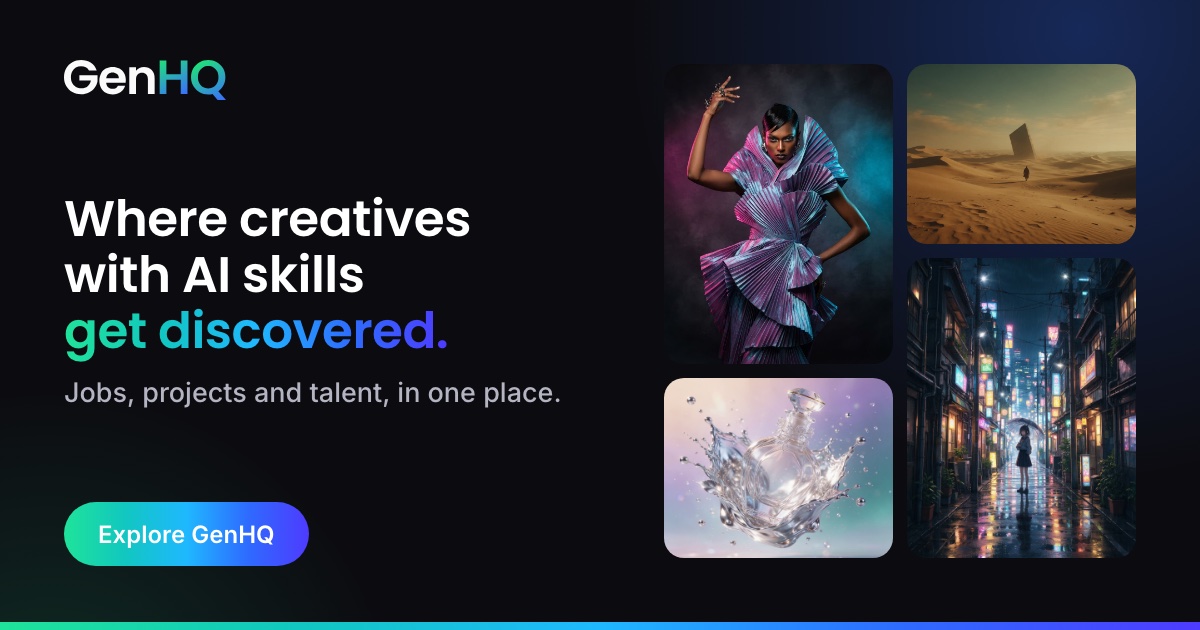
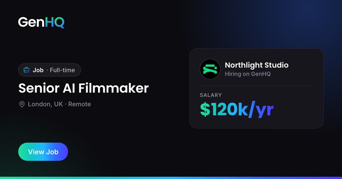
- Dark background, reversed logo top left, a Poppins SemiBold title, one gradient button.
- One call to action per card, and no URLs on the image: the link preview already shows it.
White header, colour logo at 194px wide (the 388px PNG for sharp screens), centred, with clear space all round.
Social profiles
Profile picture: the dark circular avatar (400px PNG), or the mark files in 02-mark for other sizes.

12 Downloads
Everything in one zip.
GenHQ brand assets v3.0
131 files, 3.0 MB. Logo, mark, badges, icons, colour, type and social. Includes a README.
Or take single files. Open a folder to see what's inside.
Logo01-logo/The wordmark in five versions. SVG plus PNG at 1x, 2x and 4x, and the email size.21 files, 1.7 MB
- png/genhq-logo-black@1x.png5 KB
- png/genhq-logo-black@2x.png11 KB
- png/genhq-logo-black@4x.png25 KB
- png/genhq-logo-colour@1x.png17 KB
- png/genhq-logo-colour@2x.png52 KB
- png/genhq-logo-colour@4x.png197 KB
- png/genhq-logo-email-388.png10 KB
- png/genhq-logo-reversed-glow@1x.png96 KB
- png/genhq-logo-reversed-glow@2x.png258 KB
- png/genhq-logo-reversed-glow@4x.png701 KB
- png/genhq-logo-reversed@1x.png17 KB
- png/genhq-logo-reversed@2x.png51 KB
- png/genhq-logo-reversed@4x.png197 KB
- png/genhq-logo-white@1x.png5 KB
- png/genhq-logo-white@2x.png10 KB
- png/genhq-logo-white@4x.png23 KB
- svg/genhq-logo-black.svg2 KB
- svg/genhq-logo-colour.svg3 KB
- svg/genhq-logo-reversed-glow.svg4 KB
- svg/genhq-logo-reversed.svg3 KB
- svg/genhq-logo-white.svg2 KB
Mark and app icons02-mark/HQ mark, circular avatars, app icons, Apple touch icon, favicon (SVG, ICO, PNG).28 files, 555 KB
- favicon/favicon-16.png1 KB
- favicon/favicon-32.png1 KB
- favicon/favicon-48.png1 KB
- favicon/favicon.ico3 KB
- favicon/favicon.svg2 KB
- png/app-icon-1024.png60 KB
- png/app-icon-192.png4 KB
- png/app-icon-512.png20 KB
- png/apple-touch-icon-180.png4 KB
- png/genhq-avatar-dark-400.png25 KB
- png/genhq-avatar-dark-800.png65 KB
- png/genhq-avatar-light-400.png23 KB
- png/genhq-avatar-light-800.png61 KB
- png/genhq-mark-black-1024.png14 KB
- png/genhq-mark-black-256.png3 KB
- png/genhq-mark-black-512.png6 KB
- png/genhq-mark-gradient-1024.png184 KB
- png/genhq-mark-gradient-256.png11 KB
- png/genhq-mark-gradient-512.png37 KB
- png/genhq-mark-white-1024.png13 KB
- png/genhq-mark-white-256.png3 KB
- png/genhq-mark-white-512.png5 KB
- svg/genhq-app-icon.svg2 KB
- svg/genhq-avatar-dark.svg2 KB
- svg/genhq-avatar-light.svg2 KB
- svg/genhq-mark-black.svg2 KB
- svg/genhq-mark-gradient.svg2 KB
- svg/genhq-mark-white.svg2 KB






Badges03-badges/GenHQ and Platinum, exactly as on genhq.io. SVG plus PNG at 36, 72, 144 and 512.10 files, 170 KB


Icons04-icons/Heroicons 2.2.0 outline (MIT), the set GenHQ uses, plus gradient versions of the nav icons.62 files, 34 KB
- LICENSE-heroicons.txt1 KB
- gradient/briefcase.svg1 KB
- gradient/building-office-2.svg1 KB
- gradient/globe-alt.svg1 KB
- gradient/photo.svg1 KB
- gradient/squares-2x2.svg1 KB
- gradient/tag.svg1 KB
- gradient/user.svg1 KB
- gradient/video-camera.svg1 KB
- outline/adjustments-horizontal.svg1 KB
- outline/arrow-left.svg1 KB
- outline/arrow-path.svg1 KB
- outline/arrow-right.svg1 KB
- outline/arrow-top-right-on-square.svg1 KB
- outline/arrow-trending-up.svg1 KB
- outline/arrow-up-right.svg1 KB
- outline/arrow-up-tray.svg1 KB
- outline/arrows-right-left.svg1 KB
- outline/banknotes.svg1 KB
- outline/bell.svg1 KB
- outline/bookmark.svg1 KB
- outline/briefcase.svg1 KB
- outline/building-office-2.svg1 KB
- outline/calendar-days.svg1 KB
- outline/chat-bubble-left-right.svg1 KB
- outline/check-badge.svg1 KB
- outline/check-circle.svg1 KB
- outline/check.svg1 KB
- outline/chevron-down.svg1 KB
- outline/chevron-right.svg1 KB
- outline/clipboard-document-list.svg1 KB
- outline/clock.svg1 KB
- outline/cog-6-tooth.svg1 KB
- outline/currency-dollar.svg1 KB
- outline/document-text.svg1 KB
- outline/ellipsis-horizontal.svg1 KB
- outline/eye.svg1 KB
- outline/flag.svg1 KB
- outline/funnel.svg1 KB
- outline/globe-alt.svg1 KB
- outline/heart.svg1 KB
- outline/information-circle.svg1 KB
- outline/lifebuoy.svg1 KB
- outline/link.svg1 KB
- outline/magnifying-glass.svg1 KB
- outline/map-pin.svg1 KB
- outline/paper-airplane.svg1 KB
- outline/photo.svg1 KB
- outline/plus.svg1 KB
- outline/rectangle-stack.svg1 KB
- outline/rocket-launch.svg1 KB
- outline/shield-check.svg1 KB
- outline/sparkles.svg1 KB
- outline/squares-2x2.svg1 KB
- outline/tag.svg1 KB
- outline/trash.svg1 KB
- outline/user-circle.svg1 KB
- outline/user-group.svg1 KB
- outline/user.svg1 KB
- outline/users.svg1 KB
- outline/video-camera.svg1 KB
- outline/x-mark.svg1 KB
Colour05-colour/Tokens as CSS and JSON, and an Adobe swatch file (.ase).3 files, 9 KB
Type06-type/Poppins SemiBold and Bold, Inter variable, and their SIL Open Font Licences.5 files, 1.2 MB
- Inter-Variable.ttf877 KB
- OFL-Inter.txt4 KB
- OFL-Poppins.txt4 KB
- Poppins-Bold.ttf156 KB
- Poppins-SemiBold.ttf157 KB
Social07-social/Profile avatar for social accounts (400px PNG).1 files, 25 KB
13 Changes and contact
Versions.
| Version | Date | What changed |
|---|---|---|
| 3.0 | 18 Nov 2026 | First web guide and asset pack, built from the live genhq.io design system. Five-colour brand gradient; badges renamed to GenHQ and Platinum; illustrations kept in-house. |
| 2.0 | 6 Oct 2026 | Brand Kit v2: 10-page PDF and asset folders. Replaced by this guide. |
Questions, or need a file that isn't here? Get in touch through genhq.io/contact. Please don't adapt the logo or badges to fit; ask us and we'll make the version you need.